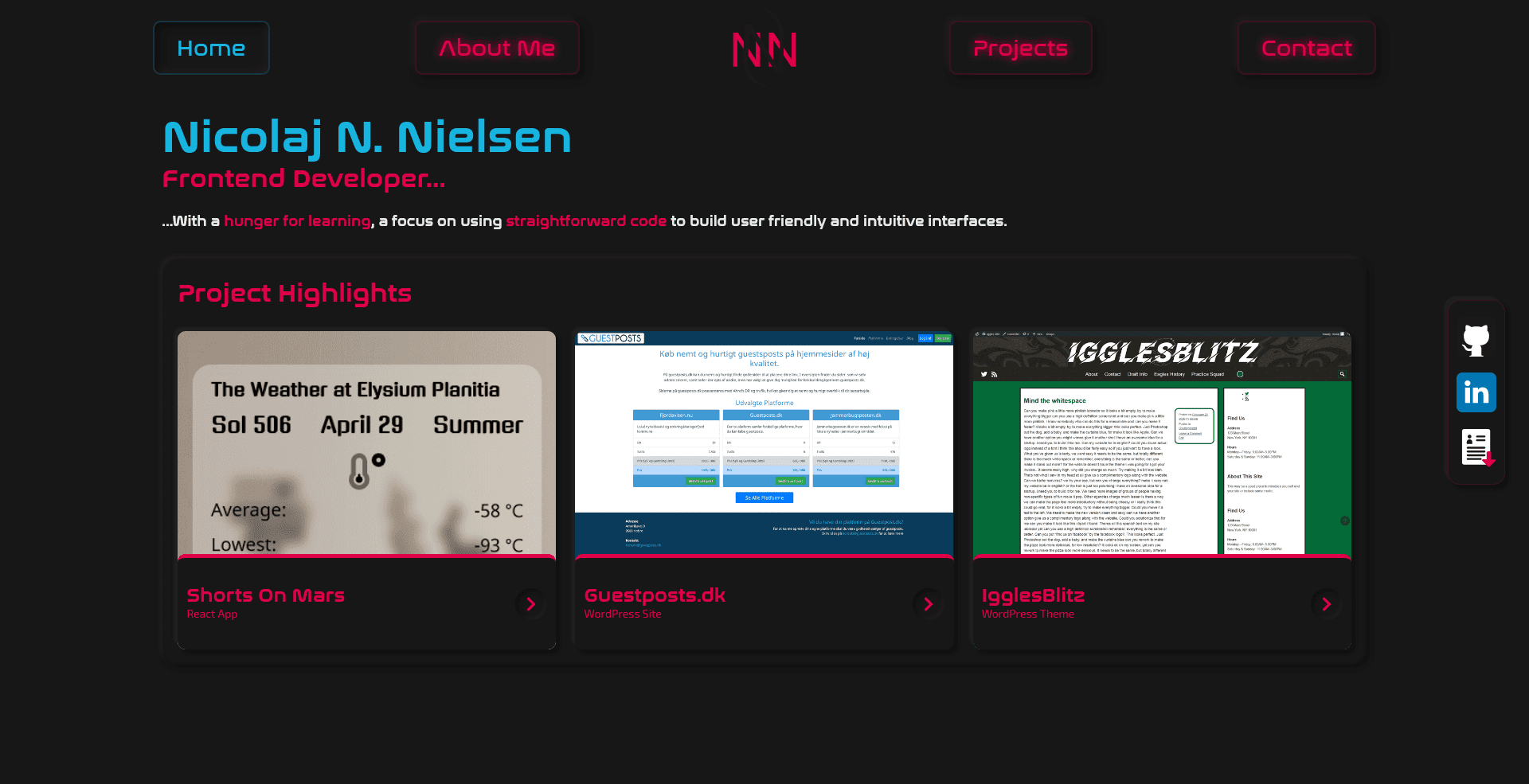
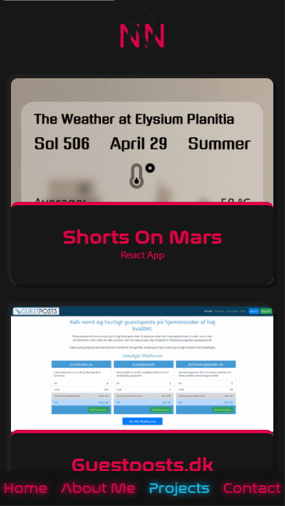
Since learning to use Gatsby, it seemed natural to move my portfolio site to the framework, for a faster static version, and better and easier editing of projects using markdown.
Challenges and learning opportunities
It was mostly a straightforward convertion of the pages and components. As the original styles structure already was divided accordingly, moving to CSS modules was easily done as well.
Most of my learning came from Gatsby and setting up its node system for sourcing markdown files for projects and images. Additionally I learned to work with GraphQL to query the data on the various pages and for stuff like the SEO component.
Implementing page transition proved to be a little challenging, due to the Gatsby Transition Link plugin, and how it handles layout components. It is setup to insert parent divs to the content, which did not play well with my grid layout. To fix it I needed to split my grid between multiple containers. I did experiment a little with the subgrid property, and it seems like that would've been a decent use for it, but unfortunately the browser support is not there yet.
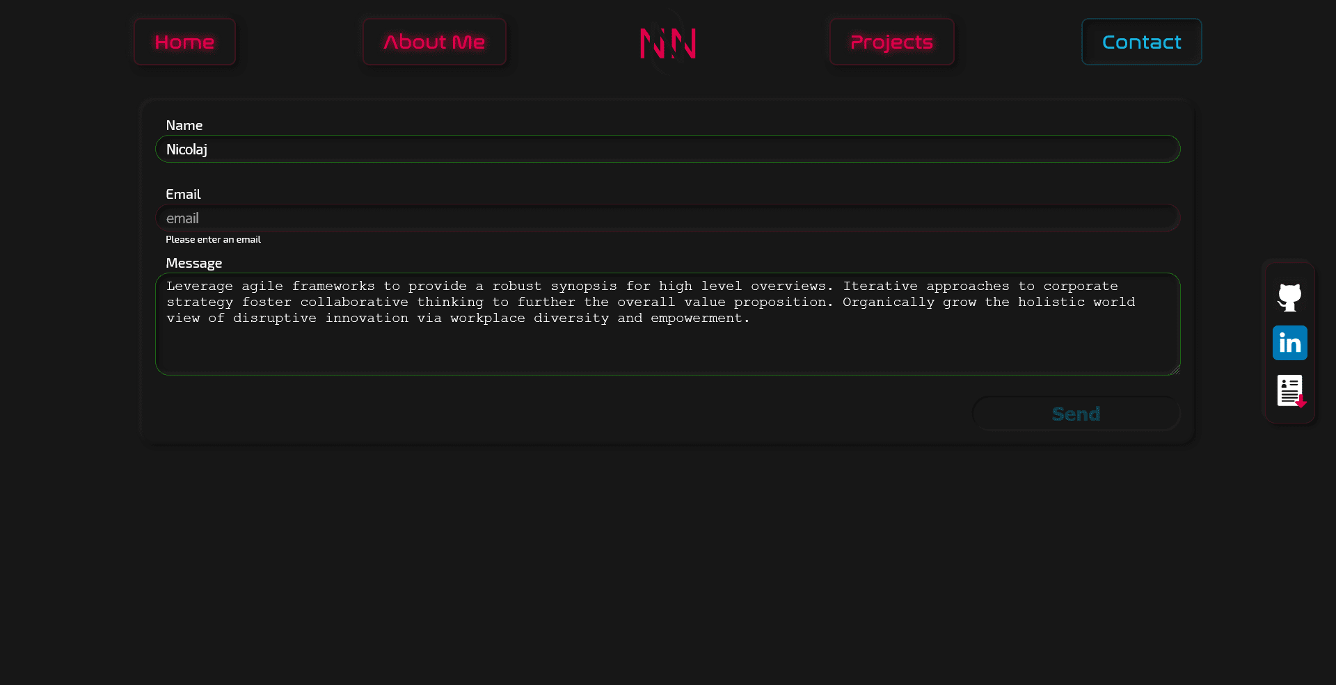
On the old version, the state for each field in the contact form was stored in a seperate useState object, having since gotten a better grip on how to handle somewhat more complex state objects and properly updating them, I moved them all into one single piece of state.
I focused quite a lot on improving the accesibility, in terms of making focus states more obvious, I utilised the 'ring' design from Tailwind, using box-shadow to create a solid line around objects, but respecting border-radius which outline does not.


